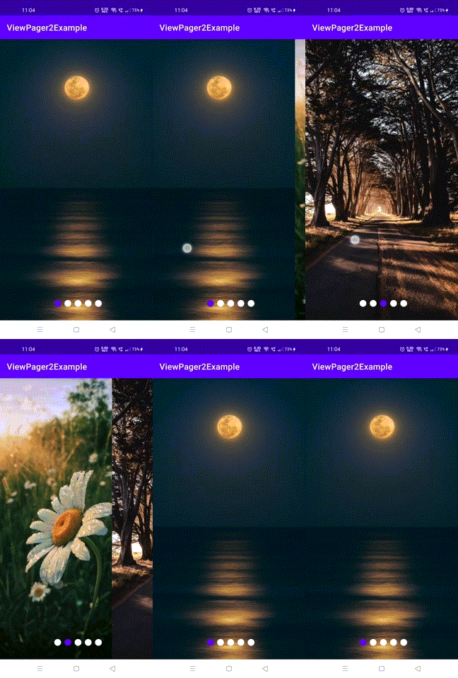
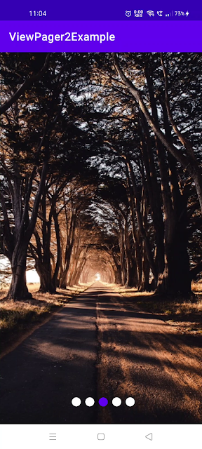
Hi There, Folks, ViewPager2 is one of the most know API in the android application development process as it gives you some cool user experience like a carousel effect, so if you have seen the web page carousels it will have a round indicator at the bottom to notify the user in which page they are in, kind of like a page number, this is a good user experience though, so previously we have created our viewpager2 with recycler view adapter if you have missed our previous tutorials look below
Viewpager2 Android Kotlin Example With Sample Code
What is a ViewPager in Android?
ViewPager Indicators:
How to add circle indicators to viewpager2 in android with kotlin:
<?xml version="1.0" encoding="utf-8"?>
<androidx.constraintlayout.widget.ConstraintLayout
xmlns:android="http://schemas.android.com/apk/res/android"
    xmlns:app="http://schemas.android.com/apk/res-auto"
    xmlns:tools="http://schemas.android.com/tools"
    android:layout_width="match_parent"
    android:layout_height="match_parent"
    tools:context=".MainActivity">


    <androidx.viewpager2.widget.ViewPager2
        android:id="@+id/viewPager"
        android:layout_width="match_parent"
        android:layout_height="match_parent" />

    <com.google.android.material.tabs.TabLayout
        android:id="@+id/tabLayout"
        android:layout_width="match_parent"
        android:layout_height="wrap_content"
        android:padding="8dp"
        android:background="@android:color/transparent"
        app:layout_constraintBottom_toBottomOf="parent"
        app:layout_constraintEnd_toEndOf="parent"
        app:layout_constraintStart_toStartOf="parent"
        app:tabBackground="@drawable/viewpager_indicators"
        app:tabGravity="center"
        android:translationY="16dp"
        app:tabIndicatorHeight="0dp"
        />

</androidx.constraintlayout.widget.ConstraintLayout>
This is a normal tab layout that has some attributes that were set to make our condition satisfy, which is to add a circle indicator to our viewpager2.
The additional attributes we have defined are
        app:tabBackground="@drawable/viewpager_indicators"
        app:tabGravity="center"
        android:translationY="16dp"
        app:tabIndicatorHeight="0dp"
these are the attributes to be defined to get a circle indicator in viewpager2, what each attribute means is simple,
app:tabBackground="@drawbale/viewpager_indicators" is the main attribute as this is where we define out drawable to make the indicators circle
app:tabGravity="center" to define the gravity of the circle indicators
android:transilationY="16dp" this is'nt actually necessary, because this only lower the view a little bit, this is added advantage if you want your indicator to place a little bit lower and in case if you want to move the circle indicators up use negative valuse like -16dp,also you can use android:transilationX="-100dp" to move the indicators to the left and positive values to move it to right
app:tabIndicatorHeight="0dp" to hide the default bottom higlighter of the tablayout
Once you have added these attributes to your view pager you have to create a selector file which should define the circle indicators of you can use a image instead,<?xml version="1.0" encoding="utf-8"?>
<selector xmlns:android="http://schemas.android.com/apk/res/android">
<item android:drawable="@drawable/viewpager_selected" android:state_selected="true"/>
<item android:drawable="@drawable/viewpager_not_selected"/>
</selector>
Above is the selector file which is under the drawable folder, for this file we need two more drawable it show, which is the state files when selected and not selected
For selected drawable
<?xml version="1.0" encoding="utf-8"?>
<layer-list xmlns:android="http://schemas.android.com/apk/res/android"
	android:shape="rectangle" >
    <item android:height="16dp" android:width="16dp" android:start="8dp" android:end="8dp">
        <shape android:shape="rectangle">
            <solid android:color="@color/purple_500"  />
            <corners android:radius="32dp"/>
            <size android:width="16dp" android:height="16dp" />
        </shape>
    </item>

</layer-list>
Note: This file requires Build SDK version 23
For not selected drawable
<?xml version="1.0" encoding="utf-8"?>
<layer-list xmlns:android="http://schemas.android.com/apk/res/android"
	android:shape="rectangle" >
    <item android:height="16dp" android:width="16dp" android:start="8dp" android:end="8dp">
        <shape android:shape="rectangle">
            <solid android:color="@color/black"  />
            <corners android:radius="32dp"/>
            <size android:width="16dp" android:height="16dp" />
        </shape>

    </item>

</layer-list>
Note: This file requires Build SDK version 23
Once you have added all the drawable for our circle indicator, its time to connect our viewpager2 with the tab layout
package com.madtutorials.viewpager2example

import androidx.appcompat.app.AppCompatActivity
import android.os.Bundle
import androidx.viewpager2.widget.ViewPager2
import com.google.android.material.tabs.TabLayout
import com.google.android.material.tabs.TabLayoutMediator
import com.madtutorials.viewpager2example.adapter.ImageViewPagerAdapter

class MainActivity : AppCompatActivity() {
    override fun onCreate(savedInstanceState: Bundle?) {
        super.onCreate(savedInstanceState)
        setContentView(R.layout.activity_main)
        val viewPager = findViewById<ViewPager2>(R.id.viewPager)
            viewPager.adapter = ImageViewPagerAdapter()
        val tabLayout = findViewById<TabLayout>(R.id.tabLayout)
        TabLayoutMediator(tabLayout,viewPager){tab, position ->


        }.attach()

    }
}
This is the same main activity file from our previous example, the extra lines of code that were added here are
        val tabLayout = findViewById<TabLayout>(R.id.tabLayout)
        TabLayoutMediator(tabLayout,viewPager){tab, position ->


        }.attach()
In the above lines of code what we are doing is that we are connecting the viewpager2 with the tab layout with TabLayoutMediator since we are only showing circle indicators, there is no need to do any more implementation here. This will automatically take care of everything.
 |
| Sample Output: Android ViewPager2 With Circle Indicator |
Conclusion:
Download Full Code: Github Link
keywords:
kotlin android viewpager2 circle indicator sample code
kotlin android viewpager2 circle indicator example
kotlin android viewpager2 circle indicator
android viewpager2 circle indicator sample code
viewpager2 circle indicator sample code


![[Tutorial] BottomSheet In Android Using Kotlin With Sample Code](https://blogger.googleusercontent.com/img/b/R29vZ2xl/AVvXsEgSLwh9pWkhnnIiz_gg9fkc8GoPFbIvFYpA358Dw4WCPLmKcLUTSf1IYDfvPt8rZfzuC5eqQWepVFVfgvZYW4QRwkQo00YrjfqcSK-TtRlrKfsBZgzk2e1PIRJX4YqhmW_iafx1D3USHJk/w72-h72-p-k-no-nu/android+bottom+sheet.png)
![[Tutorial] How To Display a Toast Message From Android Fragment](https://4.bp.blogspot.com/-O3EpVMWcoKw/WxY6-6I4--I/AAAAAAAAB2s/KzC0FqUQtkMdw7VzT6oOR_8vbZO6EJc-ACK4BGAYYCw/w680/nth.png)
![[Tutorial] How to setOnClickListener in Android Button Click with Kotlin](https://blogger.googleusercontent.com/img/b/R29vZ2xl/AVvXsEiLWlvLmjBNWD8HCFeTg_-gXcI8idP38RGR02drrn5YN1wuJIVMIM2VDOXzIf0yc7VgPG8YY_6Vv2SB4YrpCVXshh-DUSiFrd11MZ3DmZzREe6V98e8sbn3HpP9QnnBua4sX-CHAtjnZco/w72-h72-p-k-no-nu/Screenshot_1584117421.png)
0 Comments
Have doubts? Shoot your thoughts....